Environmental Opportunities


Erm, that last one doesn't mean anything, I just like it.

Magazine page 3

Here are some examples of magazine page layouts I think work and I could get inspiration from for my design work.


Magazine page 2


I like how the treatment of the typography in the title of this article makes you alter your view.

magazine page


I like the abstract layout of the body text in this magazine page. Not sure about the readability, but thats the price you pay sometimes.

doritos advert

Yeahh, my Doritos advert will NOT upload. My laptop isn't even recognising the file type.

More Cadbury's Adverts


This advert generated quite a lot of hype also. I personally dont see why. It doesnt appeal to me, but there was an article in the Metro newspaper suggesting that it did more for the Ghanaian tourism in the couple of months it aired than the tourist board did in the last 20 years. I have no idea if they did any research or just guessed.


This is another great idea. It grabs your attention straight away, and I'm pretty sure you dont have to worry that somebody else has done it before you.
I find it creepy.


I just love this advert.
I think music is a big part of an advert and can help decide whether it is successful or not.

Cadbury's


This advert is again very simple. As an idea it is completely out there. I cant imagine what was said when they proposed this as an idea, but it seems to have worked out well as nearly everyone remembers it.

The comedy pair Julian Barratt and Noel Fielding a.k.a. The Mighty Boosh created a sketch using the same idea, which goes some way to showing how big the advert became.

Treadmill Idea


This is a very simple but very clever idea. This carefully choriagraphed dance using treadmills went viral and spread across the internet. This, in turn raised attention for the band and the song.


The idea was even copied for an advert for Berocca, a vitimin supplement


Score!!!!


This is the score for my music concrete performance.

Alan Fletcher

Today I visited the Cube Gallery in Manchester to see an exhibition on 50 years of graphic work by Alan Fletcher. I can truthfully say that this visit has changed the way I think about graphic design. I thought the point was to design work that suits its purpose and is visually appealing. Fletchers work has shown me that it is more about the ideas. You have to make your audience think. A poster which is aesthetically pleasing and contains all the information, with an appropriate hierarchy, following all the rules of graphic design, will never engage its audience as much as a poster with well thought out underpinning ideas. This point is shown well in Fletchers calendars. For each month he has created a new image to represent it. For December he has a Santa Clause figure made from basic geometric shape, and November fireworks made from similar shapes. At first it is hard to make out what these images are of, but this was an intentional decision intended to make the audience think and work out what the month is. In my opinion this gets the message across a lot better than just having the word ‘December’ in a nice looking typeface.

Music Concrete


Sorry about the mistake at the end. Plectrums are hard to pick up on a flat table.

Elastic Bands


Teddy's bungee rope


C.D. keeper togetherer


Pencil grip


Secure bin bags


Makeshift wallet


Wire tidy


Bookmark


Childproof cabinets


Keeps containers closed

Hybrid

Juxtaposition in photographs is something we see a lot nowadays but man ray was one of the first to introduce this art form with his photograph called "gift";


and "Le violon d'Ingres",


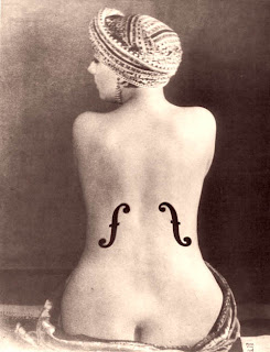
Both of these images play with your perceptions.


Here is a modern example of juxtaposition. This image has been made to play with your perceptions and desires. The bottom half shows a row of quite nice houses. It seems like a very nice place to be. whereas the top half counters this with the the smoking towers which repel you and make this place a lot less desirable.

Chindogu

"Chindōgu is the Japanese art of inventing ingenious everyday gadgets that, on the face of it, seem like an ideal solution to a particular problem. However, chindōgu has a distinctive feature: anyone actually attempting to use one of these inventions would find that it causes so many new problems, or such significant social embarrassment, that effectively it has no utility whatsoever. Thus, chindōgu are sometimes described as "unuseless" – that is, they cannot be regarded as 'useless' in an absolute sense, since they do actually solve a problem; however, in practical terms, they cannot positively be called "useful.""


Music Posters pt.2


In the 70s the punk scene exploded and it became more about rebelling against conformity. Punk was also about the idea that anybody can do it. This is represented in the advertising posters, in the typography mainly. The posters have a really hand made feel about them.

Music poster typography


These posters for Jefferson airplane and Jimi Hendrix have really abstract and psychedelic typography. This shows how you can take an element from the subject matter and incorporate it into the type. In this case psychedelic drugs were a big influence on both of these artists music and the designers have used this in the typography.
While this does create a visually appealing poster (in my opinion) the abstract typefaces do hamper legibility.


Here's an example of how parts of characters can be removed to make typography more visually appealing, while not effecting the legibility too much.


I found this picture while looking through flickr at student typography posters. This is by Jason Ellison.
The smaller characters at the bottom pilling up seem to give the image a sense of gravity, while the larger ones seem to be balanced on top. The colour scheme gives it an almost luminous effect.


This is another picture from the same site by Ryan Pallatt. I really love this picture. At a glance it looks like a mess, a huge jumble, but it catches your eye and as you look closer you see more.
I think the hierarchy works well too. Amidst the the chaos your eye is somehow drawn to the title 'Baskerville typeface' at the bottom left.

http://www.flickr.com/photos/vccgraphics/sets/72157594204888427/